
Table of Contents
ToggleBlue wall decor has become one of the most versatile tools in a homeowner’s design arsenal. Whether someone’s working with a coastal aesthetic, a modern farmhouse, or a classic traditional space, blue offers a range of shades and styles that can anchor a room or provide just the right accent. Unlike trendy colors that fade fast, blue has staying power, it’s been a staple in interior design for decades and continues to evolve with new textures, patterns, and materials. This guide covers practical ways to select, install, and style blue wall decor that works with existing spaces without requiring a full renovation.
Key Takeaways
- Blue wall decor offers versatile design solutions across coastal, modern farmhouse, and traditional styles, with staying power that transcends seasonal trends.
- Choose lighter blues for small rooms to enhance perceived space, and test shades under different lighting conditions before committing to ensure the best match for your room’s natural light and color temperature.
- Blue wall decor pairs effortlessly with neutrals, natural wood tones, and metals while hiding minor wall imperfections better than stark colors, making it ideal for refreshing existing spaces without full renovations.
- DIY projects like gradient canvases, stained wood art, and fabric-wrapped panels provide budget-friendly ways to add custom blue wall decor within hours.
- Balance multiple pieces using the rule of thirds, mix different blue shades to add depth, and combine smooth and textured surfaces to create visual interest without overwhelming the space.
- Layer blue decor strategically using the 60-30-10 color rule—keeping blue accents to roughly 10% of the room to complement rather than compete with dominant wall and furniture colors.
Why Blue Is the Perfect Color for Wall Decor
Blue works across nearly every room and design style because it balances warmth and coolness depending on the undertones. Navy and cobalt bring depth and drama without the heaviness of black, while powder blue and sky blue open up smaller spaces and reflect light.
From a psychological standpoint, blue promotes calm and focus, ideal for bedrooms, home offices, and bathrooms. But it’s not limited to quiet spaces. Bright cerulean or turquoise can energize a kitchen or playroom, and deeper indigo tones add sophistication to dining rooms or entryways.
Blue also pairs well with a wide range of materials. It complements natural wood tones (both light oak and dark walnut), works alongside metals like brass and brushed nickel, and contrasts cleanly with white trim or neutral walls. That flexibility makes it easier to layer blue decor into an existing color scheme without repainting or replacing furniture.
Another practical advantage: blue hides minor wall imperfections better than stark white or black decor. Textured blue pieces, like woven wall hangings or dimensional art, can camouflage uneven drywall or small dings, which is helpful in older homes or high-traffic areas.
Best Types of Blue Wall Decor for Every Room
Blue Wall Art and Prints
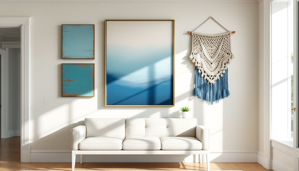
Framed prints and canvases are the most straightforward way to add blue to a wall without permanent changes. Look for pieces that incorporate multiple shades of blue, this adds visual interest and makes it easier to tie in other accent colors in the room.
When selecting frames, consider the room’s existing trim and molding. If baseboards and door casings are painted white, a white or light wood frame keeps the look cohesive. In spaces with dark trim or exposed beams, black or espresso frames provide better contrast.
For high-moisture areas like bathrooms, opt for acrylic or metal prints instead of paper-based art. Standard paper prints can warp or develop mold in humid conditions, even when framed under glass. Acrylic prints are sealed and moisture-resistant, and they don’t require additional framing hardware.
Abstract blue art works well in modern or transitional spaces, while botanical prints or coastal scenes suit farmhouse or traditional decor. Many DIYers find success sourcing DIY artwork projects to customize pieces that fit exact color palettes and dimensions.
Textured Blue Wall Hangings and Tapestries
Woven tapestries and macramé bring texture and warmth that flat art can’t achieve. These work especially well in bedrooms and living rooms where softening hard surfaces (drywall, tile, hardwood) improves acoustics and visual balance.
When hanging fabric-based decor, use wall anchors rated for the actual weight of the piece, not just the decorative hanging rod. A 4-foot tapestry can weigh 5–10 pounds once the rod and hardware are included. For drywall, toggle bolts or molly bolts distribute weight better than plastic anchors. In older homes with plaster and lath, pre-drill pilot holes to avoid cracking.
Blue ceramic or wood wall sculptures add three-dimensional interest. These are particularly effective in dining rooms or hallways where flat art can feel underwhelming. Just confirm the mounting hardware is appropriate for the wall type, some heavy ceramic pieces require mounting directly into studs, especially in earthquake-prone regions.
For renters or anyone avoiding wall holes, leaning art and decor is a practical alternative. Large framed prints or wooden panels can lean against the wall on a console table, mantel, or floor. Use museum putty or adhesive strips at the base to prevent sliding.
How to Choose the Right Shade of Blue for Your Decor
The right shade depends on three factors: room size, natural light, and existing color temperature.
In small rooms (under 150 square feet), lighter blues, powder, sky, or robin’s egg, help walls recede visually and make the space feel larger. Darker blues like navy or Prussian blue can work in small spaces if there’s ample natural light, but they’ll make a dim room feel cave-like.
For rooms with south-facing windows (Northern Hemisphere), which get warm, direct light most of the day, cooler blues with gray or green undertones prevent the space from feeling too warm. In north-facing rooms with cooler, indirect light, warmer blues with slight purple or teal undertones add needed warmth.
Test shades in the actual room before committing. Paint stores sell sample pots, but for wall decor, order fabric swatches or print samples on cardstock. Tape them to the wall and observe them at different times of day, morning light, midday sun, and evening lamplight all shift how blue appears.
Consider the 60-30-10 rule: 60% of the room should be a dominant color (usually wall paint or large furniture), 30% a secondary color (upholstery, rugs), and 10% an accent (artwork, decor, pillows). Blue wall decor typically falls into that 10% accent category, so it should either complement or contrast the dominant color, not compete with it.
Interior designers often reference color trend guides when coordinating palettes, especially during seasonal shifts or when updating multiple rooms.
DIY Blue Wall Decor Projects You Can Make This Weekend
Project 1: Gradient Blue Canvas
This requires minimal tools and no special skills:
Materials:
- Stretched canvas (16×20 inches or larger)
- Acrylic paint in three blue shades (light, medium, dark)
- Foam brushes or wide paintbrushes
- Painter’s tape
- Drop cloth
Steps:
- Tape off the canvas edges with painter’s tape for clean borders.
- Apply the lightest blue across the top third of the canvas using horizontal strokes.
- Apply the medium blue to the middle third, slightly overlapping the top color while it’s still wet.
- Apply the darkest blue to the bottom third, blending the edges where colors meet.
- Let dry for 24 hours, then remove tape.
Tip: Work quickly while paint is wet to achieve smooth blending. If paint dries too fast, mist lightly with water from a spray bottle.
Project 2: Stained Wood Wall Art
This works well in rustic or modern farmhouse spaces.
Materials:
- Three 1×6 boards (actual dimensions: ¾”×5½”), cut to 24 inches
- Blue wood stain or diluted acrylic paint
- Sandpaper (120-grit)
- Foam brush
- Wood glue or brad nails
- Picture hanging hardware
Steps:
- Sand boards smooth, especially edges and ends.
- Apply stain or diluted paint (mix 1 part paint to 2 parts water for a translucent finish).
- Wipe excess with a rag for a weathered look, or apply multiple coats for solid coverage.
- Once dry, arrange boards side-by-side and secure with wood glue or brad nails on a backing piece (¼” plywood works).
- Attach D-rings or sawtooth hangers to the back.
Safety note: Wear gloves when working with stain, and ensure adequate ventilation. Some oil-based stains emit VOCs that require respirator use in enclosed spaces.
Many DIYers share additional techniques and budget-friendly project ideas that can be adapted for blue color schemes.
Project 3: Fabric-Wrapped Panels
This is renter-friendly and fully reversible.
Materials:
- Foam core boards or cork boards (12×12 inches or custom size)
- Blue fabric (cotton or linen work best)
- Spray adhesive or fabric glue
- Utility knife
- Command strips or picture hooks
Steps:
- Cut fabric 2 inches larger than the board on all sides.
- Apply spray adhesive to one side of the board.
- Center fabric over the adhesive, smoothing out wrinkles.
- Wrap excess fabric around to the back and secure with glue or staples.
- Hang using damage-free adhesive strips or traditional picture hooks.
Styling Tips: Pairing Blue Wall Decor With Your Existing Space
Work with neutrals first. Blue pairs effortlessly with white, gray, beige, and taupe. If the room already has neutral walls and furniture, blue decor can be layered in without clashing. For bolder combinations, pair blue with warm wood tones, terracotta, or mustard yellow.
Balance the color temperature. Cool blues (those with gray or green undertones) pair well with crisp whites and silvers. Warm blues (those leaning toward purple or teal) work better with cream, gold, and warm woods like cherry or oak.
Create visual weight. If hanging multiple pieces, arrange them so the visual weight is balanced. A large piece on one side of a sofa can be balanced by two smaller pieces on the other side, or by a floor lamp and plant.
Use the rule of thirds for groupings. When arranging three or more pieces, position them so they form a triangle or follow the golden ratio. Avoid centering everything, offset arrangements feel more dynamic and less formal.
Consider lighting. Blue decor looks different under warm-toned bulbs (2700K–3000K) versus cool daylight bulbs (5000K+). In rooms with warm lighting, cooler blues may appear muted. Test the decor under the actual lighting conditions before final placement.
Don’t overmatch. Mixing multiple shades of blue, navy, teal, and powder, for example, adds depth. Matching everything to the exact same shade can feel flat and monotone.
Layer textures. Combine smooth surfaces (glass, acrylic) with rough ones (wood, fabric). This prevents the decor from blending into the wall and adds tactile interest.
Respect scale. In rooms with 8-foot ceilings, oversized art (larger than 36×48 inches) can overwhelm the space. In rooms with 10-foot or vaulted ceilings, undersized pieces get lost. A general guideline: wall art should cover roughly two-thirds to three-quarters the width of the furniture below it (sofa, console, bed).
PPE reminder: When installing heavy decor or drilling into walls, wear safety glasses to protect against dust and debris. Use a stud finder to locate framing before driving screws or anchors, especially for pieces over 10 pounds.