
Table of Contents
ToggleA well-executed gallery wall transforms a blank expanse into the room’s visual anchor. It’s not about slapping frames on drywall, it’s about intentional composition, proper spacing, and secure installation. Whether working with family photos, thrift store prints, or original artwork, the mechanics matter as much as the aesthetics. This guide walks through layout planning, hardware selection, and installation techniques that prevent crooked frames and patched-over mistakes. No fluff, just the practical steps to get it right the first time.
Key Takeaways
- Gallery wall decor creates visual impact through intentional composition, proper spacing, and secure installation rather than randomly placing frames on a wall.
- Plan your gallery wall layout using paper templates before drilling holes, and choose between grid, salon-style, or linear arrangements depending on your space and aesthetic preference.
- Use frame consistency with uniform colors, a limited palette, or eclectic styles paired with cohesive artwork to tie the arrangement together and avoid a chaotic appearance.
- Hang gallery wall arrangements with the center at eye level (57-60 inches from the floor) and maintain uniform 2-3 inch spacing between frames for a professional result.
- Select appropriate hanging hardware based on wall type and weight—drywall supports 10-15 pounds with standard hangers, while heavier frames require wall anchors or stud mounting.
- Balance your gallery wall with 5-15 frames using odd numbers of each content type, a cohesive color palette, and varied scales to create intentional asymmetric balance without individual images getting lost.
What Is Gallery Wall Decor and Why It Works
Gallery wall decor is a curated arrangement of framed artwork, photographs, or objects hung in a deliberate pattern or organic cluster on a wall. Unlike single statement pieces, gallery walls gain impact through collective composition, mixing frame sizes, orientations, and content types to create visual rhythm.
The appeal is both aesthetic and functional. In rooms with tall ceilings or long hallways, a gallery wall fills vertical space without requiring oversized (and often expensive) artwork. It also allows incremental building, start with three frames, add more as budget and collection grow.
From a design standpoint, gallery walls work because they create a focal point that draws the eye upward and across the wall plane, making rooms feel more finished. They’re particularly effective above sofas, along stairwells, or in dining rooms where wall space tends to go unused. The key is treating the arrangement as a single composition rather than individual pieces that happen to share a wall.
Planning Your Gallery Wall Layout
Start by measuring the wall space and marking boundaries with painter’s tape. For installations above furniture, leave 6-8 inches of clearance between the furniture top and the lowest frame. The overall arrangement should occupy roughly two-thirds the width of the furniture piece below it.
Three common layout approaches:
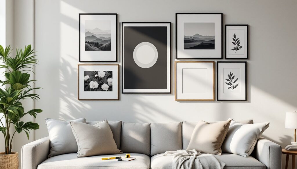
Grid layout: Frames of identical size hung in uniform rows and columns. Cleanest look, easiest to measure and level. Spacing between frames typically runs 2-3 inches both horizontally and vertically.
Salon-style: Mixed frame sizes in an organic, asymmetric arrangement. Requires more planning but offers flexibility. Lay out frames on the floor first, maintaining consistent spacing between all edges.
Linear arrangement: Frames hung in a single horizontal or vertical line with aligned tops, bottoms, or centers. Works well in narrow spaces like hallways.
Before drilling, create a paper template. Trace each frame onto kraft paper or newspaper, cut out, and tape templates to the wall. This lets you adjust spacing and composition without putting holes in the wall. Mark hanging hardware locations directly on templates.
Measure from the frame’s top edge to the hanging wire or sawtooth hanger when pulled taut, this offset determines where the nail actually goes. A common mistake is measuring to the wire’s resting position, which results in frames hanging lower than planned.
Choosing the Right Frame Styles and Colors
Frame consistency ties disparate artwork together. Three reliable approaches:
Uniform frames: All frames match in color and style (all black wood, all white matted, all natural wood). This approach works with any artwork mix and creates instant cohesion. It’s the safest choice for beginners.
Limited palette: Two or three frame colors that repeat throughout the arrangement. For example, alternating black and natural wood, or mixing brass and white frames. Requires more planning but adds visual interest.
Mixed eclectic: Varied frame styles, colors, and materials. Only attempt this if the artwork itself shares a common thread, color palette, subject matter, or era. Without that unifying element, the result reads as chaotic rather than curated.
Mat versus no mat: Mats create breathing room around artwork and make small pieces feel more substantial. Standard mat width runs 2-4 inches on all sides. White and off-white mats suit most applications: colored mats can pull accent colors from the artwork but require careful coordination.
Frame width matters for visual weight. Thin frames (0.5-1 inch profile) suit modern, minimal spaces and keep focus on the artwork. Wider frames (2-3 inches) add presence and work better with traditional decor or when displaying smaller prints that need more visual heft.
Many budget renovation ideas leverage thrifted frames repainted in a cohesive color, a cost-effective way to achieve the uniform look without buying all new materials.
Selecting Artwork and Photos That Tell Your Story
Effective gallery walls balance variety with cohesion. The arrangement should feel intentional, not random.
Content mixing: Combine personal photos, art prints, typography, mirrors, or even three-dimensional objects like small shelves or wreaths. Odd numbers of each type prevent the wall from looking too symmetrical. For example, five family photos, three abstract prints, and one vintage mirror creates asymmetric balance.
Color coordination: Pull a 3-5 color palette from the room’s existing decor and ensure most artwork incorporates at least one of those colors. This doesn’t mean everything matches, just that there’s visual thread connecting pieces. Black-and-white photography serves as a neutral that works with any palette.
Scale variation: Mix frame sizes with purpose. In salon-style walls, largest frames typically anchor the center or bottom, with smaller pieces radiating outward. Avoid clustering all large frames on one side, which creates visual imbalance.
Subject matter: Personal photography gains impact when it includes variety, candid shots alongside portraits, landscapes mixed with close-ups. If incorporating art prints, many home crafting projects offer tutorials for creating custom pieces that match the home’s style without the cost of commissioned work.
Avoid common pitfalls: Don’t print all photos at the same size then mat them differently, it wastes mat space and limits layout options. Don’t include so many pieces that individual images get lost: 5-15 frames suits most residential walls.
Print quality matters for photography. Home inkjet prints fade and shift color over time, especially in rooms with direct sunlight. Professional printing on archival paper costs more upfront but maintains appearance for years. UV-protective glass or acrylic prevents fading for valuable pieces, though it adds cost and reflective glare.
Step-by-Step Installation Guide
Tools and materials needed:
- Measuring tape and pencil
- Level (24-inch minimum: laser level simplifies multi-frame installations)
- Hammer or drill/driver
- Picture hanging hardware appropriate to wall type and frame weight
- Painter’s tape
- Paper templates
- Stud finder (for heavier frames)
Hardware selection:
Drywall alone supports 10-15 pounds maximum with a standard picture hanger nail driven at a 45-degree angle. For frames exceeding that weight, use wall anchors or mount into wall studs.
Drywall anchors: Toggle bolts support up to 50 pounds in 1/2-inch drywall: plastic expansion anchors handle 20-30 pounds. Pre-drill holes for anchors using a bit sized to manufacturer specs.
Studs: Wood studs (typically spaced 16 inches on center) provide the most secure mounting for heavy artwork. Use a stud finder to locate, then drive screws directly into the stud.
Installation steps:
-
Finalize layout using paper templates. Tape templates to wall, step back, and assess composition from multiple angles and seating positions. Adjust until satisfied.
-
Mark hanging points. With templates taped in final position, measure and mark where nails/screws will go. Account for the offset between frame top and hanging hardware. Transfer marks from templates to wall using a pencil.
-
Install hardware. Work from the center frame outward, or from largest to smallest. Use a level to check each frame before moving to the next. For grid layouts, establish the first row with extra care, subsequent rows align to it.
-
Hang frames. Start with the central or largest piece. Hang it, confirm level, then work outward. Make minor adjustments as you go: what looked perfect on paper may need tweaking once frames are up.
-
Final leveling. Step back frequently and check from eye level. Small variations (1-2 degrees off level) become obvious once all frames are hung. Adjust as needed.
Safety note: Wear safety glasses when drilling overhead. Use a dust mask if drilling into plaster or older walls that may contain lead paint dust.
For comprehensive gallery wall arrangements showing different installation patterns, reference examples that demonstrate proper spacing and compositional balance.
Common Gallery Wall Mistakes to Avoid
Hanging too high: The gallery wall’s center should sit at eye level, approximately 57-60 inches from the floor. This is the standard museum height and ensures the arrangement engages viewers rather than floating near the ceiling.
Inconsistent spacing: Measure and maintain uniform gaps between frames. In salon-style walls, spacing doesn’t need to form a grid, but the distance between any two frame edges should be consistent, typically 2-3 inches. Uneven gaps look accidental.
Skipping templates: Eyeballing placement results in extra holes, uneven spacing, and off-level frames. The 20 minutes spent creating paper templates saves hours of patching and repainting.
Wrong hardware for weight: Lightweight plastic hangers fail under the combined weight of frame, glass, mat, and artwork. Check the hardware’s weight rating and use anchors or stud mounting for anything over 15 pounds. Frames crashing down damage both wall and artwork.
Ignoring wall material: Plaster walls require pre-drilling to prevent cracking. Brick or concrete needs masonry bits and appropriate anchors. Tile shouldn’t be drilled without carbide bits and extreme care. Know the wall structure before making holes.
Over-matting small images: A 5×7-inch photo in a 16×20-inch frame with an 8-inch mat looks lost, not elegant. Mat width should be proportional to image size, 2-3 inches for prints under 8×10 inches, up to 4 inches for larger pieces.
Forgetting lighting: Gallery walls in dim hallways or poorly lit rooms lose impact. Add picture lights, track lighting, or wall sconces to highlight the arrangement, especially for artwork with fine detail or subtle color.
No plan for growth: If intending to add frames over time, leave space in the initial layout or plan an expandable arrangement like a grid that can grow vertically or horizontally. Adding frames to a “complete” salon-style wall often requires rehang everything.
Conclusion
Gallery walls deliver visual impact when approached with the same care as any finish carpentry project, measure twice, hang once, and use hardware rated for the load. Template layouts before committing to holes, maintain consistent spacing, and hang at proper eye level. The difference between a professional-looking installation and a amateur attempt comes down to planning, appropriate hardware, and taking time to level each frame.